

Splitwise Redesign
Discovery
Context
Splitwise, originally launched as a minimum viable product (MVP), has grown into one of the most recognized tools for managing shared expenses. However, with increasing competition from fintech apps and banking services offering similar features, the platform must evolve to retain user loyalty, stand out visually, and reinforce its reputation as a reliable and innovative solution.
This solo UX/UI redesign was completed in December 2023 as part of a UX Hackathon hosted by Uxberg School. Focused on iOS and Android platforms, the project targeted the most common user journey: creating or joining a group, logging expenses, applying a split, and settling balances.
Though not affiliated with or commissioned by the Splitwise team, the project is grounded in real user feedback, usability testing and competitive analysis.
Challenge
Despite its utility, many users expressed frustration with Splitwise’s core workflows. The app’s layout had become unnecessarily complex with navigation spread across too many sections, leading to increased cognitive load and reduced focus.
Objectives
The primary goal was to improve the core experience of splitting and settling expenses by making it faster, more transparent and more enjoyable. Rather than introducing new features, this redesign aimed to:
- Reduce friction in common flows
- Clarify terminology and interactions
- Reorganize the app to reflect how users actually think about shared finances
Problem Definition
Competitive Analysis
The project began with user interviews and a competitive analysis of similar apps, including Splittr, Tricount and Settle Up. Three major pain points consistently emerged comparing the competitors to Splitwise:
- Confusing terminology
- Unintuitive split configuration
- Fragmented navigation

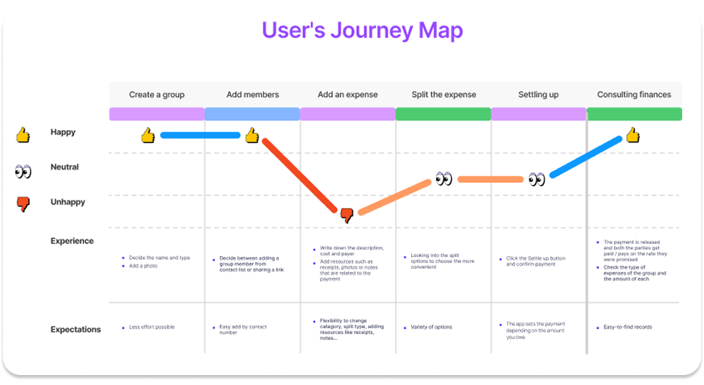
User Journey
The redesign focused on the most essential flow: creating a group, adding members, logging and splitting expenses, settling balances, and consulting financial records. A user journey map was created to visualize user feelings, expectations, and friction points throughout this core experience.
The emotional curve dips during expense entry and splitting, confirming that these two stages carry the highest cognitive load and confusion. However, the overall journey recovers well, with positive sentiment at both the start and end. This validates a redesign strategy focused on simplifying mid-journey friction points, while reinforcing the clarity and satisfaction users already experience in other areas.
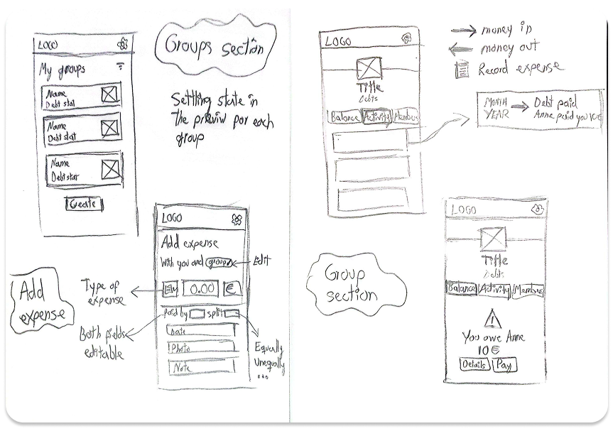
Solution Design
Information Architecture
The redesign consolidates the app into three primary areas: Groups, Add Expense and Friends
This streamlined structure reduces friction and allows users to take action quickly, understand their financial standing, and maintain control over their data.
- Groups: Offers a clear view of shared balances and recent activity.
- Add Expense: Reimagined as a central action accessible from any screen.
- Friends: Enables one-on-one financial tracking and settlements outside of groups. Users can view shared history, settle individual balances, and reinforce personal accountability.
Settlement is now fully integrated into each group or friend page. Rather than a generic “Settle Up” button, the app offers contextual prompts and guided steps to help users complete payments or record settlements with clarity and confidence.
Visual System and Prototype
The proposed visual language adopts a modern and approachable aesthetic by using clean lines, rounded shapes, and a unified turquoise palette.
Microinteractions such as confirmation animations and input feedback are designed to offer reassurance at key touchpoints.


Reflection
The redesigned Splitwise app delivers a smoother and more intuitive path through one of the most common shared financial tasks. By refining navigation and clarifying language the experience becomes faster, more reliable and more user-friendly.
